Blue Omni
Summary
I jumped into this project when the backend was already built. They needed a user interface that was more human-friendly. Cyber Security data is really hard to look at, it is mostly cold data and sometimes people have no idea what they are looking at.
Website Link:
https://www.github.com/susannagy
Role
react, ux, ui, design, front end development, css, adobe xd

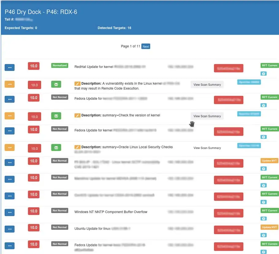
The former interface was built out with buttons and tables in Bootstrap by the back end developers. It was a little confusing to look at and interact with, so that needed some treatment. I needed the sections displayed in ways that are more familiar and clean.
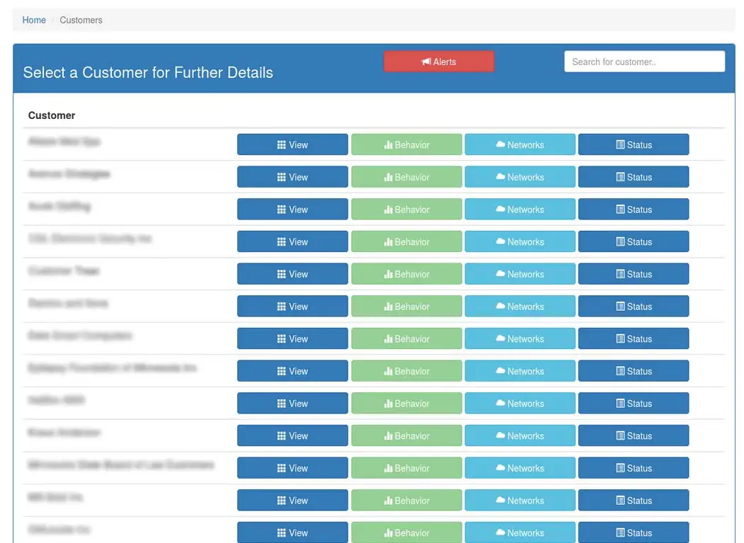
Here is another former interface. Pretty straight forward but repetitive.
BlueOmni login screen
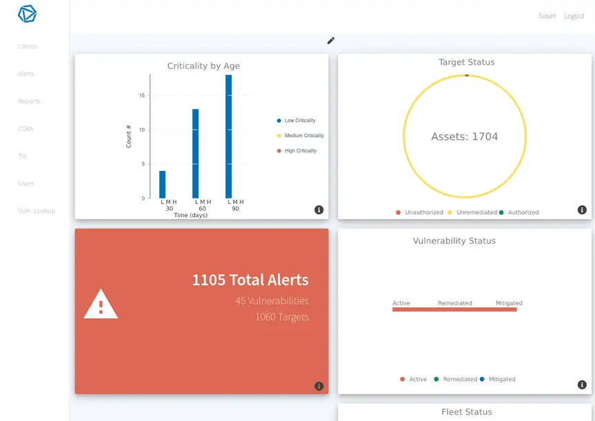
After logging in the user would see a dashboard with data visualizations that they have the option to customize. The Cyber Security Technician using this UI would be able to see the clients status, criticalities, and alerts in the dashboard view as well as having a sidebar for tidyness, instead of a repetitive table of buttons.
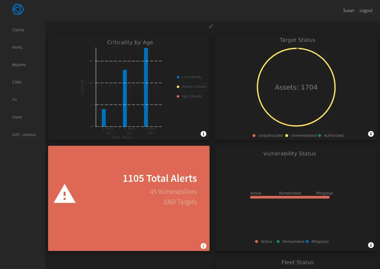
Switching between light and dark themes are pretty cool these days I hear.
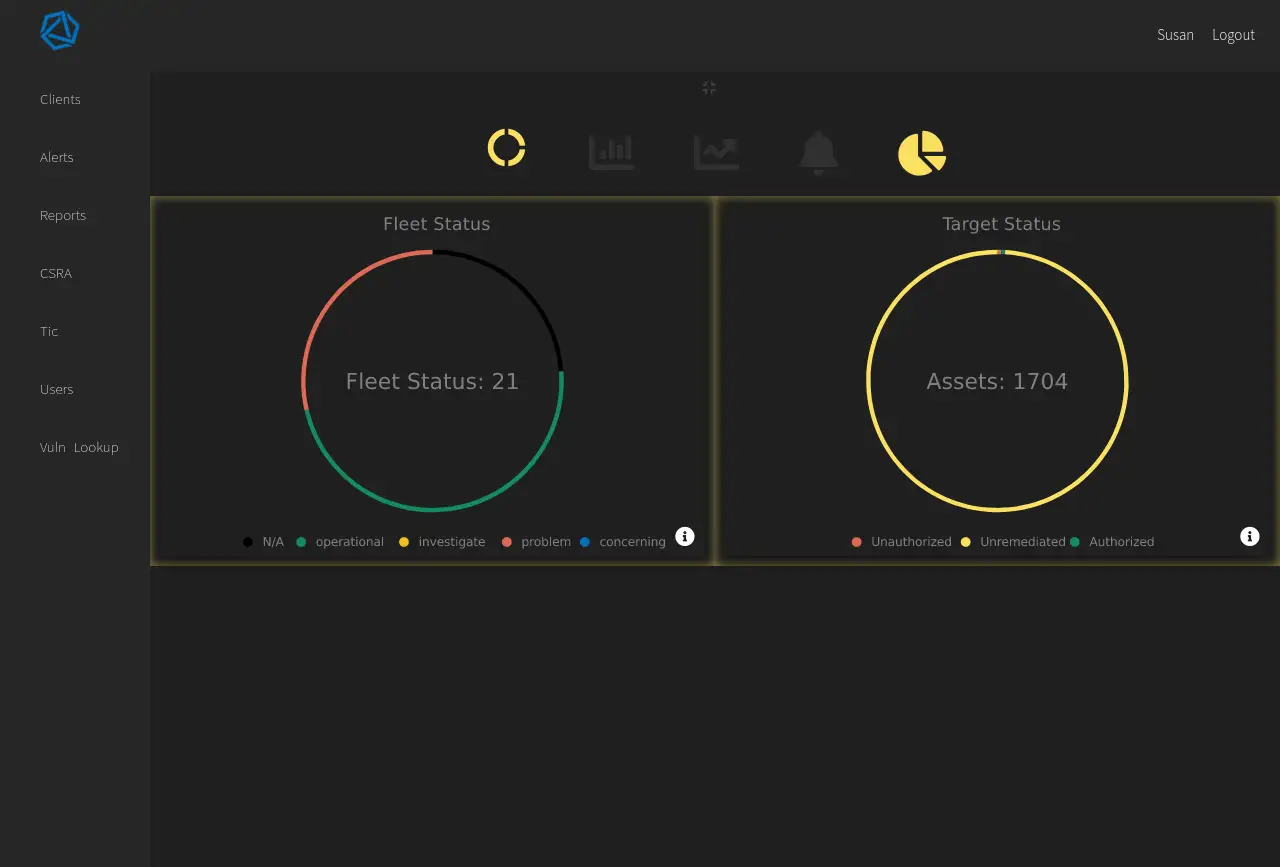
We implemented a feature where you can select a type of data visualization module, rearrange each module, and add or remove modules. The module conifguration were auto saved via an API call to the backend.
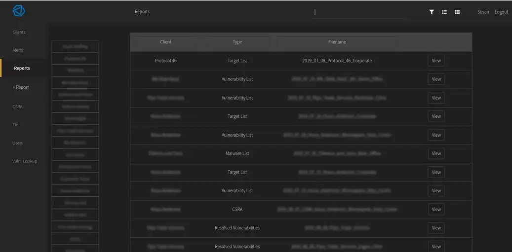
Newer table interface. The example here is a Reports page where a user can click the filter icon and it expands a keyword field. They can also choose between a table and a tile view.
