All Pro Door
Summary
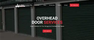
Redesigned a website with lots of service pages and needed to come up with ways to make all the information visually appealing, organized, engaging, and more modern.
Website Link:
https://allprodoor.net/
Role
wordpress, design, photoshop, modern design trends, elementor, icons, branding, layouts

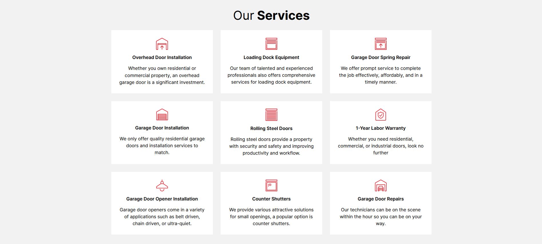
I would like to gush a little bit about how awesome some of these sections turned out. The spacing, the layouts, the consistent branding, and being able to find icons that are just right:

More awesome icons relevant to garage types:

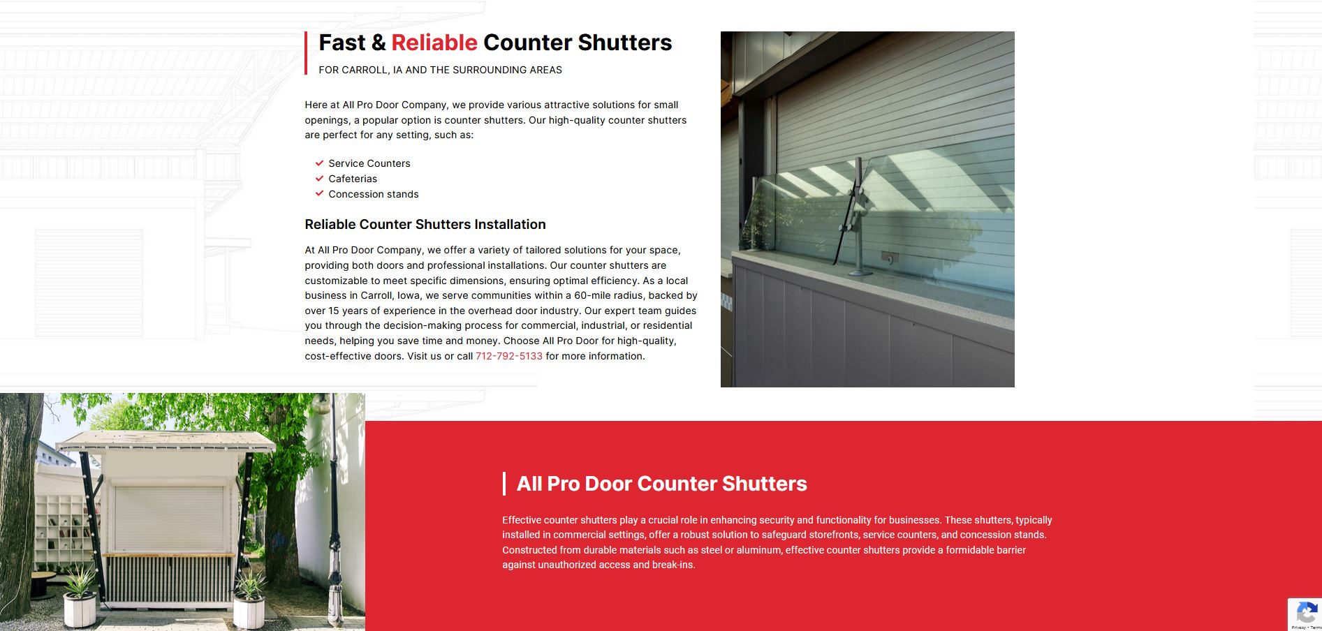
Interesting usage of line backgrounds relevant to the topic as well as section headings and image layouts:

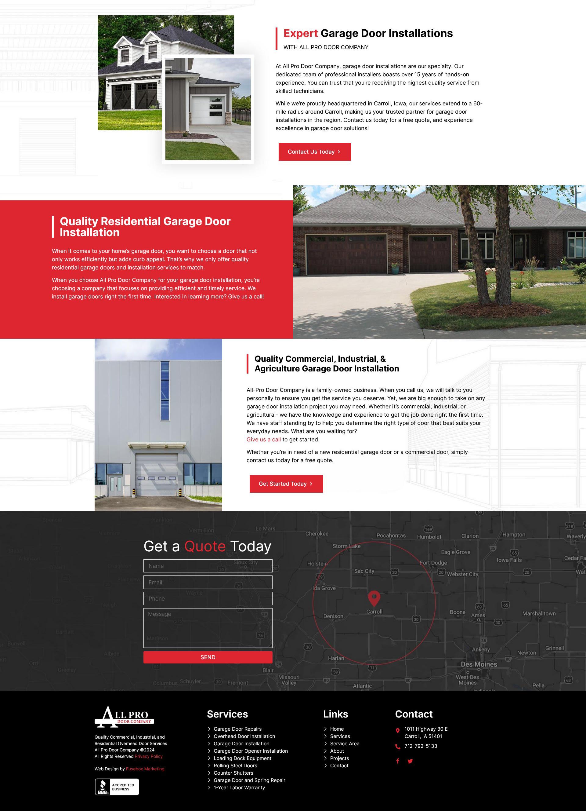
Broke out of the norm with these asymetrical section layouts:

Tidy sections with organized sections of information in accordions:

Just a sweet overall flow of information and modern web design and layouts:

Making lots of information visually intersting:
