Zonked
Summary
A conceptual brand for a bold, fun coffee company
Website Link:
N/A
Role
illustration, brand strategy, color, font, patterns
I usually start all my design processes with a mood board on Pinterest to draw inspiration from to convey the overall look, feel and vibes through color, imagery, fonts and graphics:
I love how simple and minimalistic coffee beans are. You can go from simple shapes, add a little curve and a slant, and you have a visually appealing coffee bean.

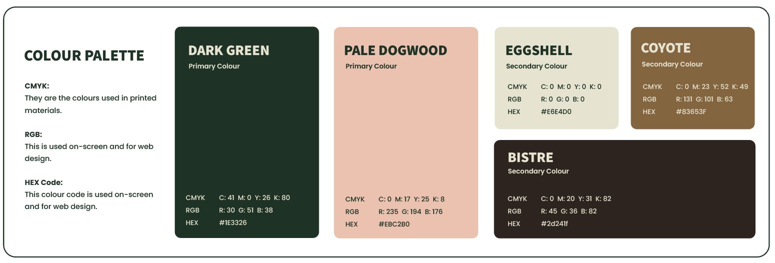
The color palette was chosen combining a few important key elements to make this brand stand out. The dark green captures northern vibes of pine trees and forests, much like that of the Pacific Northwest - the central hub for all things coffee (at least in the states). Or being up north in a cabin, surrounded by pine trees waking up with a mug of coffee in your hand, and a cozy blanket. The beige, brown and dark brown captures the preferences of coffee whether a dark roast, with cream/milk or mocha/caramel. Pink captures playful, sweet flavors on your taste buds or approaching your mornings with the softness of waking up.
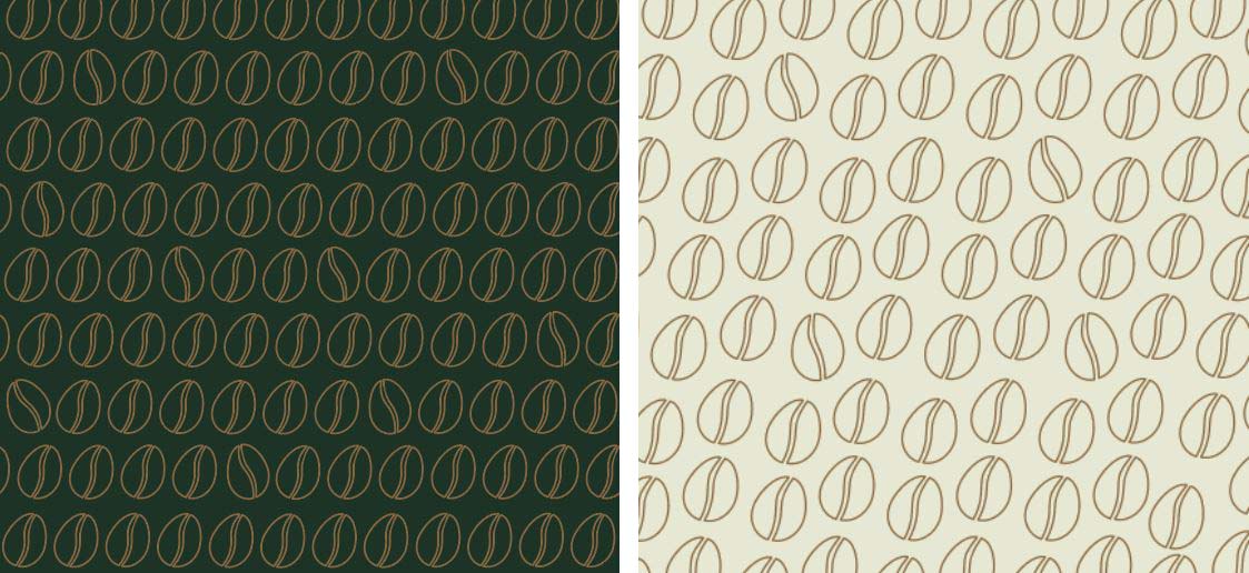
Now that we have a main character to this brand and a color palette, lets create patterns. We can go for a few different vibes here. One is more somber, like when you are just waking up, the other is more light, like an extra spring in your step. Maybe its a light roast with some caramel. Who knows. But all the beans in the pattern also have an extra spring in their steps, disrupting the monotny of pattern and order - just wiggling away like the little beans that they are.
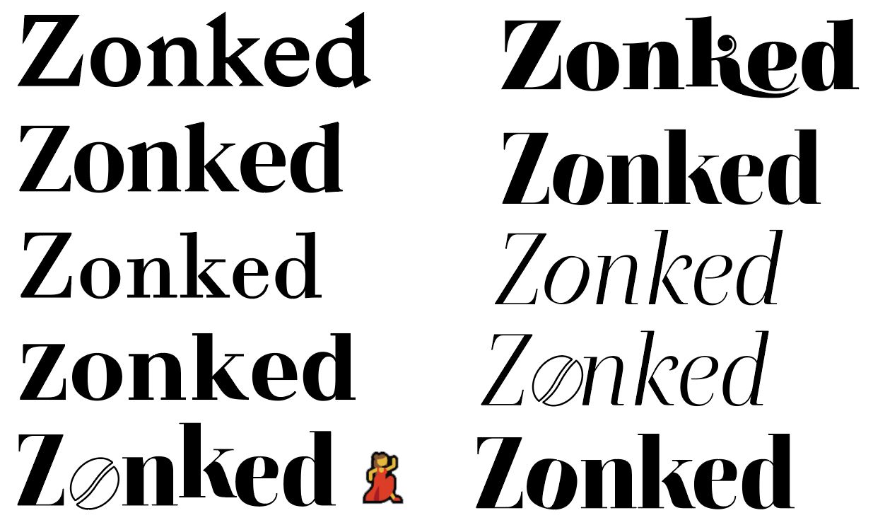
It cant be a brand without fonts. For this bold and playful brand, I was envisioning a nice bold serif that just stands out on a coffee cup, with a little play on the O with a bean. Maybe a little dance to the letters.
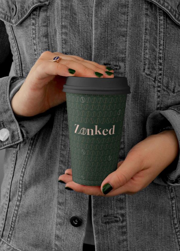
Now lets bring it all together:
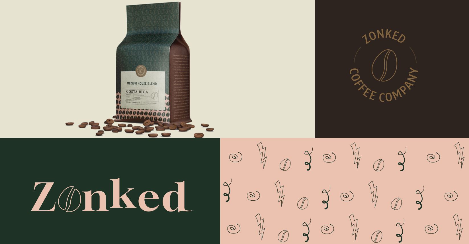
Coffee packaging, additional log/seal, OG logo, and some additional patterns/assets
