Ava Swim
Summary
Ava Swimwear blends inclusive sizing, high-quality materials, and timeless, stylish designs. They wanted to add confidence, sex appeal, and adventure while keeping a classic, flirty touch.
Website Link:
N/A
Role
illustrator, branding, strategy, mood, vibes
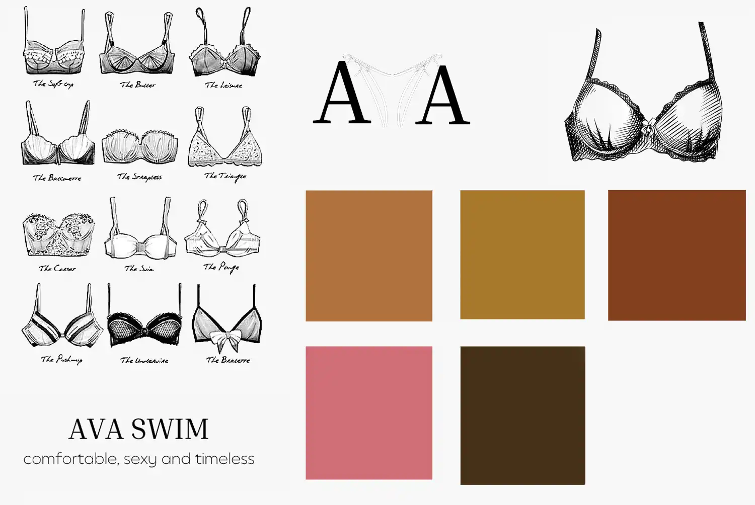
Client had a clear idea of the font pairings, colors, and main logo mascot they wanted but needed someone to pull it all together into a cohesive visual identity for the brand. Here’s what they sent over for inspiration:
I entered the creative tank and started drawing inspiration from the internet, focusing on the classic, flirty, timeless, trendy energy of this brand:

Starting with a strong serif for the header fonts, we iterated on these until she was happy with the 5th one down in the first column:
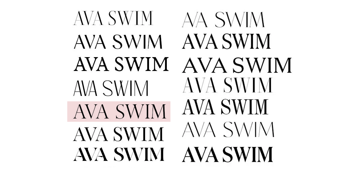
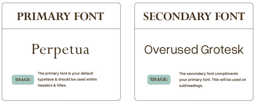
Here are the finalized header and body fonts:
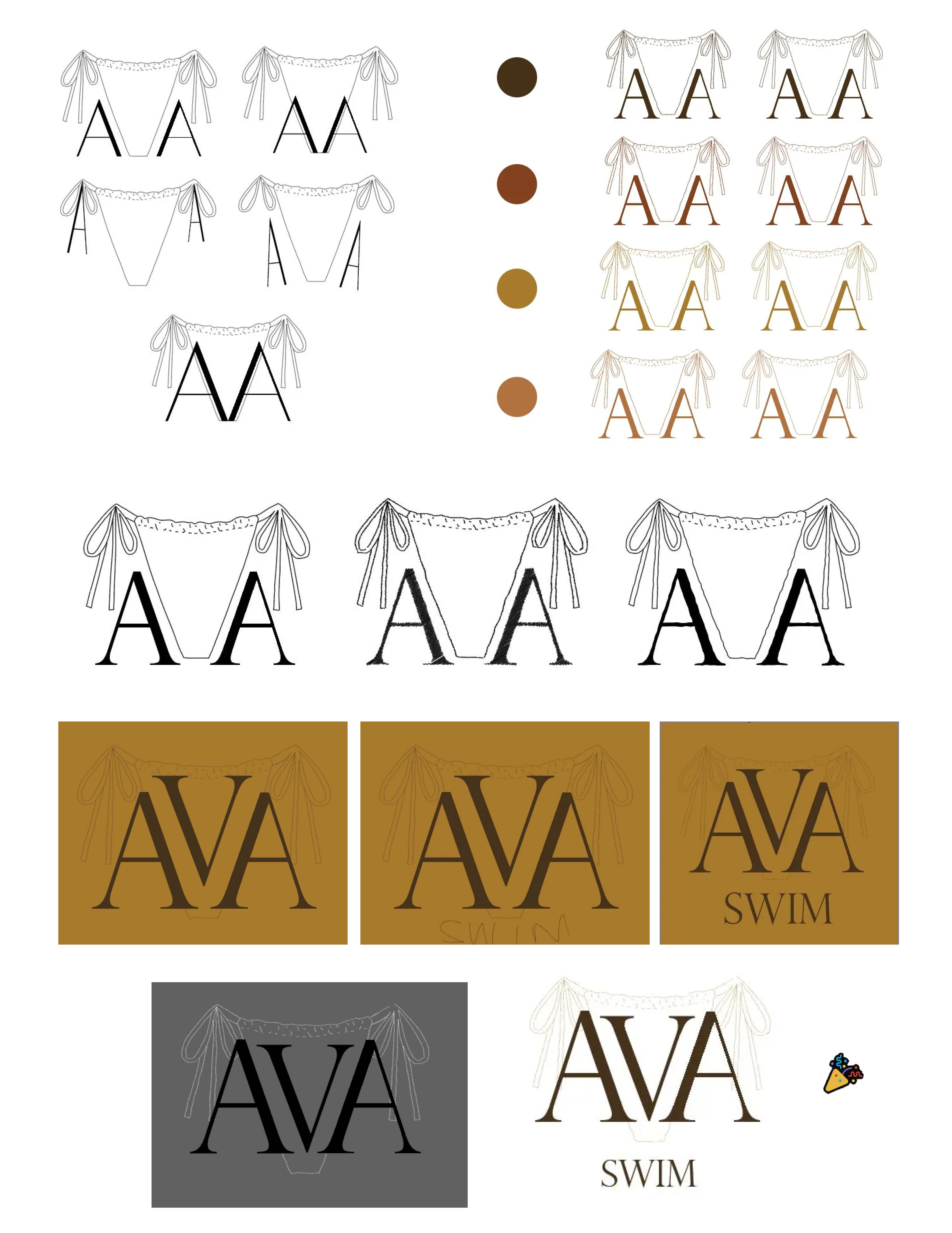
Logo iterations:
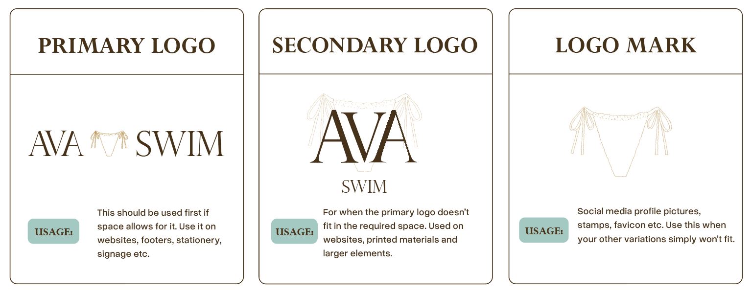
Final logos:
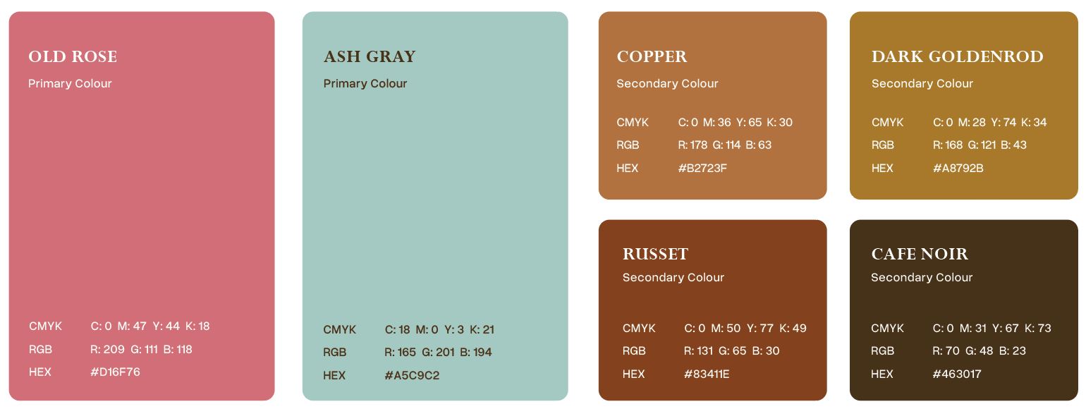
I kept the palette that was requested because it was already pretty strong, but I wanted to add a nice blue that plays well with the pink and the golden and brown colors:
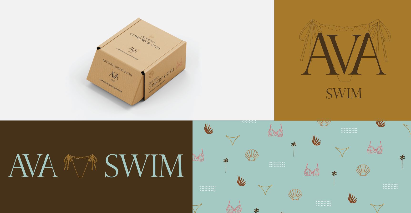
Once the fonts, logo, and colors are set, the illustrations and patterns truly bring the brand to life. These elements make a strong first impression, shaping how people perceive the brand and helping it stand out from competitors. It’s all about refining and balancing the right elements to create a cohesive look. These assets can be applied to packaging, website layouts, and letterheads. For example, adding a few simple beach elements, a bikini top, and a minimalist bikini bottom felt perfect for the brand’s vibe—they work seamlessly as a pattern that could be used on items like shopping bags or membership cards.

Packaging mockup, logos and patterns 😊
